Projects
- How do you translate an immersive physical experience to digital?
- By playing on the parts that make mini golf larger than life.
- How do you revive the disruptive spirit of an established name?
- By colliding the worlds of two new core ingredients.
- How do you reimagine a reigning legacy for the East?
- By looking a little further West.
- How do we transport the nation to Passione Vino - and get them to buy?
- By capturing the spirit of better spirits
- How do you champion a brand’s machine-like precision, without losing sight of its human heart?
- Embrace the friction between the two
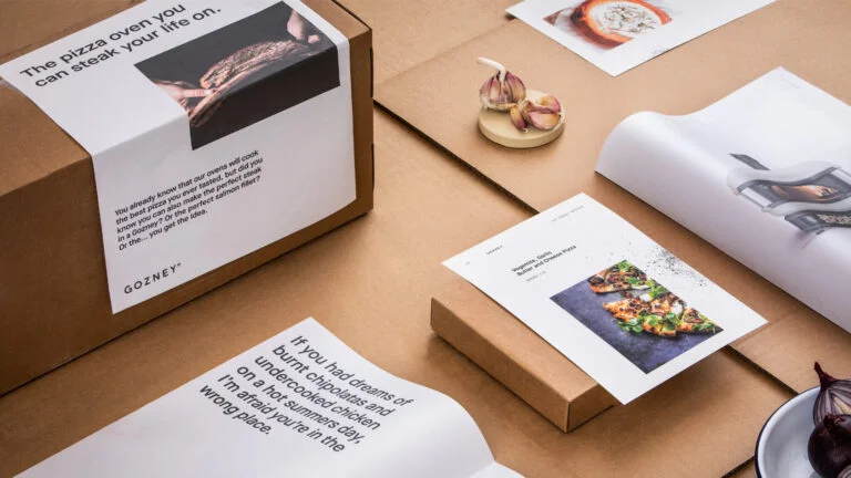
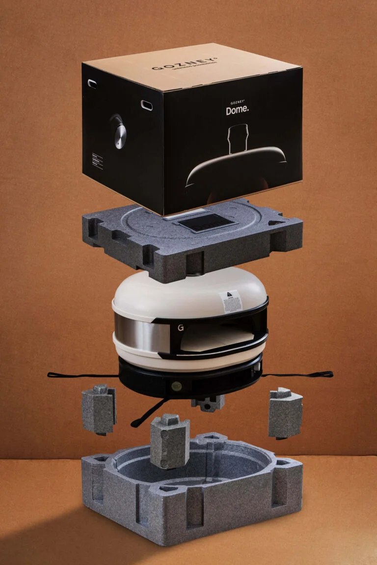
- How do you convince the world it’s time to say RIP to the BBQ?
- Showcase a way of life, not just a way of cooking
Treetop Adventure Golf
Copywriting, Digital, Insight & Strategy
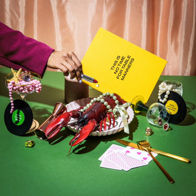
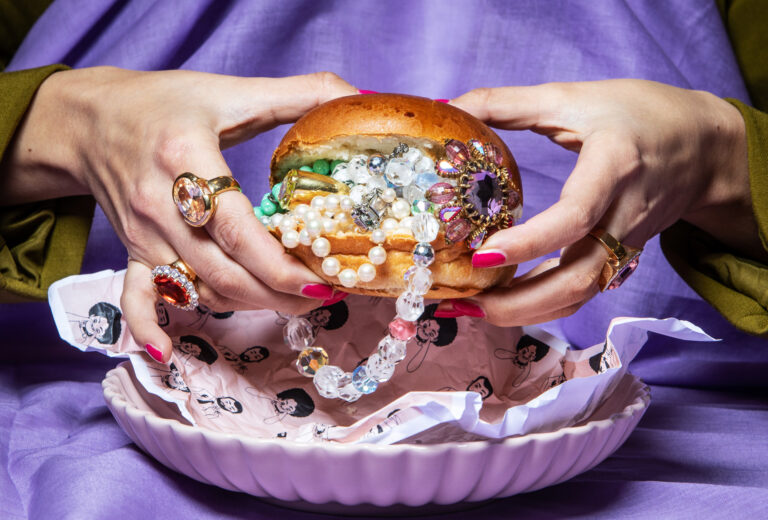
Burger & Lobster
Brand, Content, Copywriting, Insight & Strategy
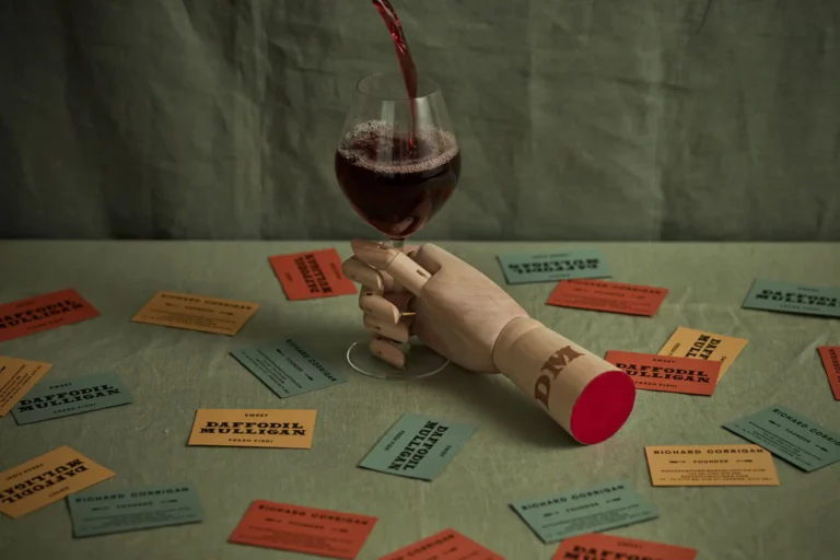
Daffodil Mulligan
Brand, Print
Passione Vino
Brand, Digital, Insight & Strategy, Print
Empty State
Brand, Digital, Insight & Strategy, Motion
Gozney
Brand, Campaign, Insight & Strategy, Motion, Print