Mentorship
Forty Eight Point One x NTU Part 1
A live student brief exploring the CBD market
Earlier this year we were asked to take part in a series of live briefs with a group of second year students at Nottingham Trent University.
As someone who attended university a little later in life, I have always been hugely appreciative of my experience there. It enabled me to get out of a job where I worked to live and step into an industry that I love. One where I very much live to work. Design has given me so many opportunities – and continues to. So I was naturally thrilled when myself and fellow Creative Director Joe were invited to take part in the live briefs.
A CBD Infused, Alcohol Free IPA
Our brief challenged students to produce packaging and a landing page for a non-alcoholic beer infused with 30mg of CBD, designed to offer the perfect end-of-the-day, wind-down drink without the negative effects of drinking alcohol daily.
The beverage was aimed at the 21+ market of health conscious, young professionals looking for something new. The product would be housed in 330ml bottles as an IPA, containing 30mg of CBD and would be sold by the crate (12 bottles) via an online subscription service.
We also asked that the students avoided using cliches like marijuana leaves and flavour names like ‘Amnesia Haze’ / ‘AK47’ etc. This needed to be a truly original response to our brief.
Finding a winner
We were genuinely blown away by the work of the students who took part in the brief and many of the entries took us by surprise and took us down a road we weren’t expecting.
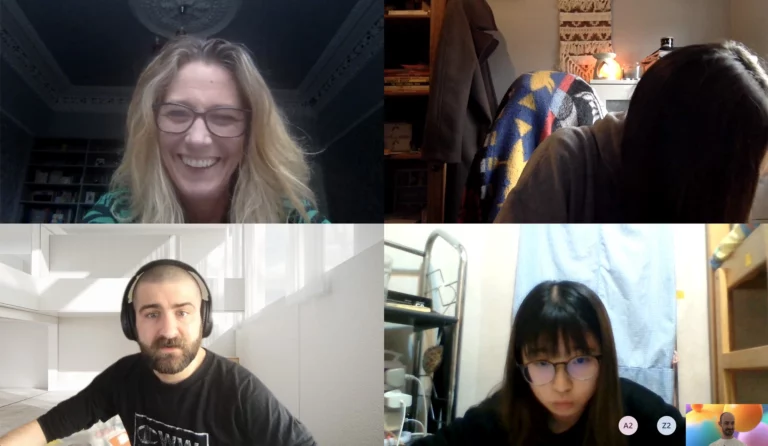
On top of that, the interception of a global pandemic meant that all of the presentations had to be done via Zoom. A nerve-racking experience for sure and one that was handled with a real level of maturity.
But there could only be one winner.
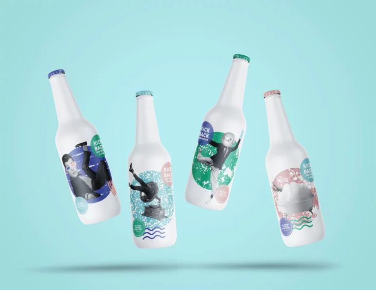
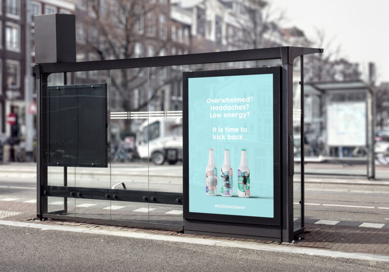
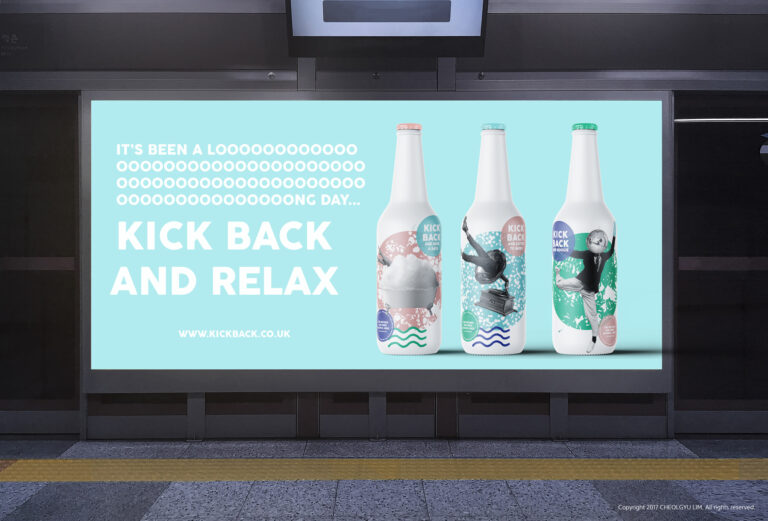
CBD Infused and Zero Alcohol Used
Nicole’s entry focussed on the laidback element of the drink, inviting her consumers to kick back and unwind with a healthy alternative. The soft colours and playful illustrations juxtaposed the calm with the lucid and created a brand that encouraged people to enjoy, embrace and utilise their free time. To actually unwind.
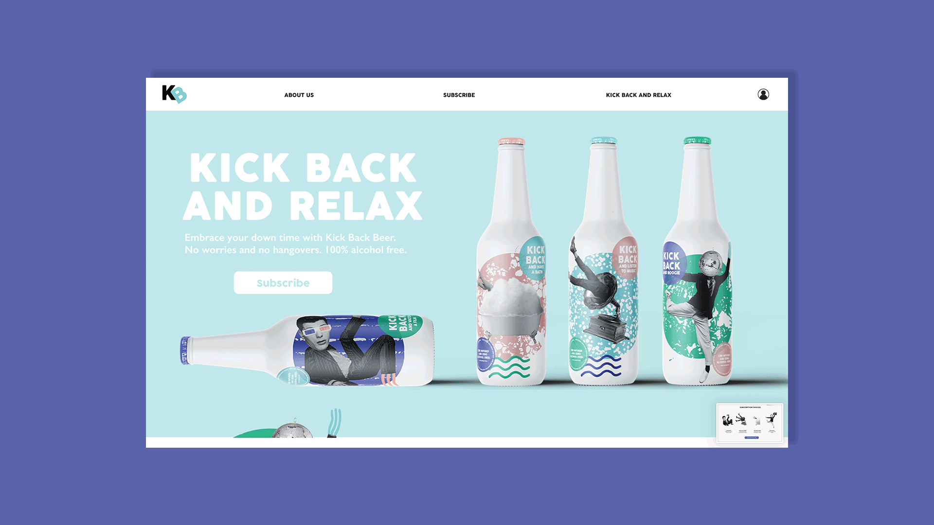
Nicole’s approach to digital really impressed us. She’d prototyped her site to a really high standard, considering the user journey and experience. She had also thought about the variety of subscription options offered as well as gifting options. You can see the full site here.
Monthly partnerships were also included to help promote relaxation. These included film subscriptions and spa products and we loved that these helped to amplify the importance of wellbeing and work-life balance.
Honourable Mentions
Alongside Nicole, there were several other entries that we felt responded to our challenge in interesting and unexpected ways. In no particular order, we’ve included our list of runners up below.
Lewis Bownes
Lewis took us to a lucid dreamland inspired by Ukiyo-e woodcuts and guitar pedals. Not a marriage we’d thought of before. But we liked it.
Alice White
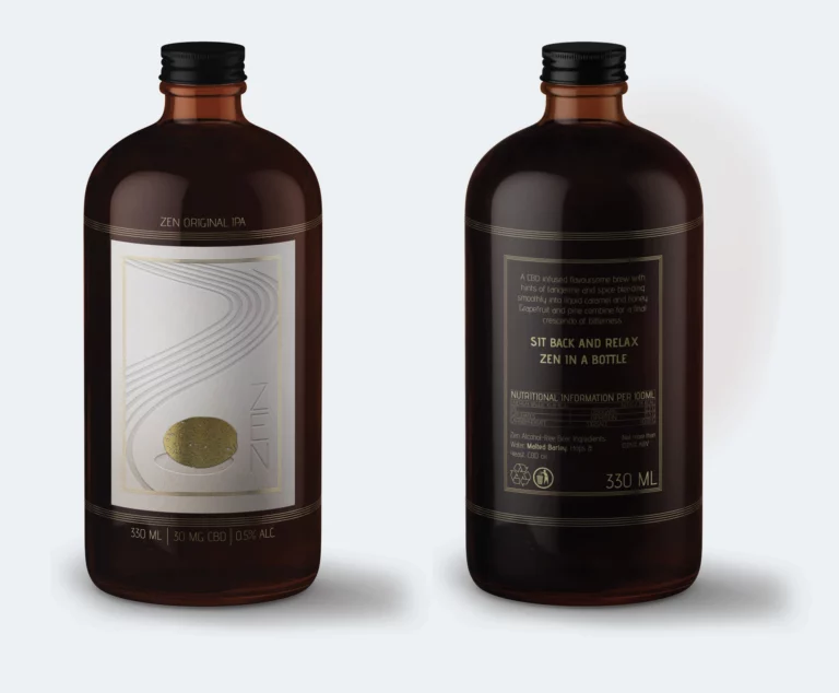
From lucid dreams to zen gardens, Alice took a much calmer approach using process to elevate the concept and enhance the messaging. From the soft ‘Z’ embossed into the paper stock (a nod to the raked circles in the sand), through to the bottle shape and shiny golden pebble, the packaging alone transported us to a calmer place.
Yin Lam Wong
Yin focussed on CBD’s anxiety-reducing claims and used her packaging to enhance the message. Holographic labels were overlaid with ink to create a label that consumers could scratch into as a method of stress relief. A really smart solution rooted in the benefits of the product inside.
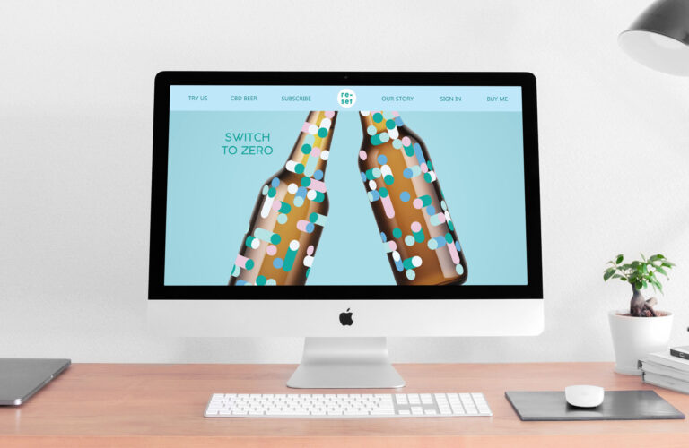
Ruby Kerr
Ruby’s brand ‘Reset’ was a graphic play on the reset sliders found on digital devices. For many, smartphones and tablets amplify their anxiety levels through constant news streams (anyone else get the ‘covid news you missed while you were asleep’ update, daily?) and rose tinted social media streams. The positive sentiment of switching off both metaphorically and physically from the digital world felt like an important message. One firmly in-tune with what the product was all about.
Jasmine Jethwa
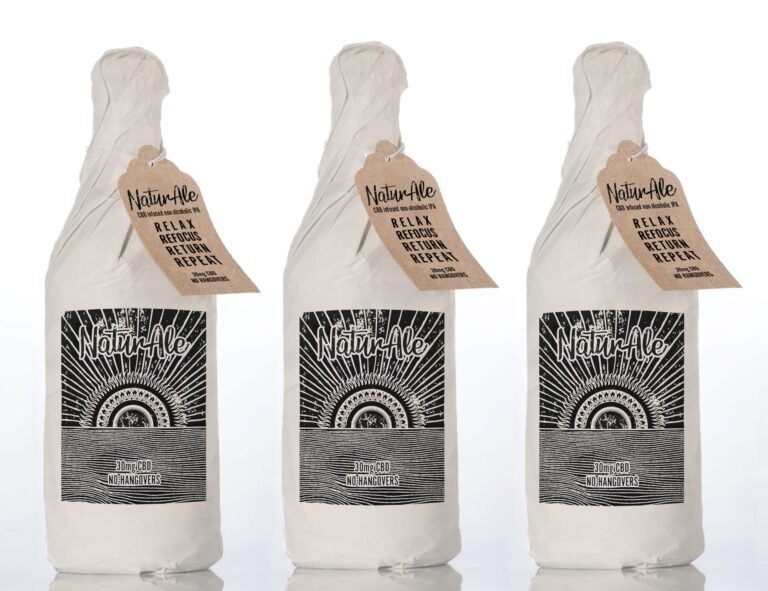
Jasmine’s NaturAle set its sights on connecting people with the natural world, using tactile materials and sustainable printing techniques. With a mandala at the center of the brand story as a metaphor for the circular mantra of ‘relax, refocus, return, repeat’, NaturAle promoted a more meditative approach to product consumption.
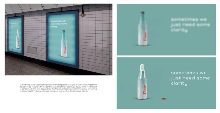
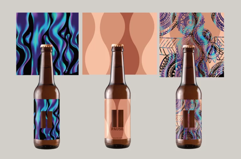
Mark Barrios
And last but by no means least, Mark Barrios. Mark’s ‘Flow’ brand honed in on the word’s definition ‘1. the state of peak focus that occurs when performing a task. 2. to proceed continuously and effortlessly’. This felt perfectly aligned for a drink focussed on people using CBD to help them unwind and rest effectively at the end of the day. Only by doing this can they achieve optimum focus at work. We particularly liked Flow’s advertising campaigns which played with digital advertising and focus to carry the message to consumers.